
The Rebrand Continues
New Tags, New Banner, and Some Great Markets
If you've been following along with the Little Hummingbird Studio journey, you'll know the rebrand hasn't stopped at just a new name and logo. Every market I go to, I'm adding another little piece to the puzzle, and this month brought two big ones: brand new product tags and the first outing of my market banner.
Laser-Cut Tags, Fresh From the Workshop
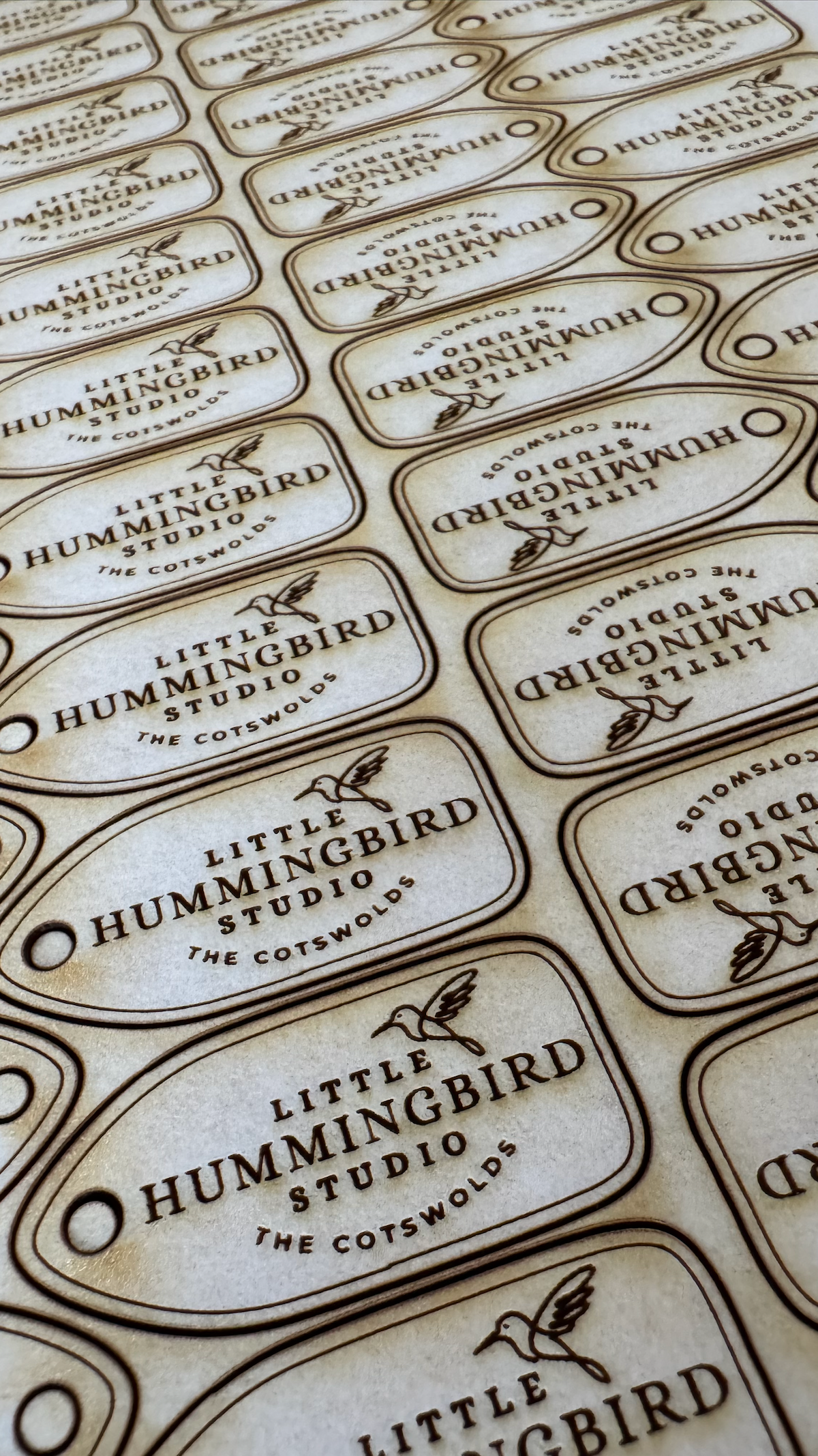
I've spent a good chunk of workshop time this month designing and cutting a whole batch of new product tags, and I'm genuinely thrilled with how they've turned out. Each one is laser etched and cut right here in the studio, carrying the hummingbird motif and "The Cotswolds" line that's now become the signature of the brand.
There's something really satisfying about seeing sheet after sheet of them coming off the laser. Rows and rows of little tags, each one identical, each one ready to be tied onto a coaster, a piece of resin art, or whatever's coming out of the workshop next. It's a small detail, but it's exactly the kind of finishing touch that makes a handmade product feel considered rather than thrown together and it keeps things consistent with the palette I settled on for the whole brand, no clashing colours, just clean text and lines etched straight into natural material.
Practically speaking, batching these has been a game changer too. Instead of cutting tags one product at a time, I can now get a full sheet ready in one go and just work through the pile as new stock gets finished, which is exactly what I need heading into the busier Christmas market season.
The Banner's First Outing
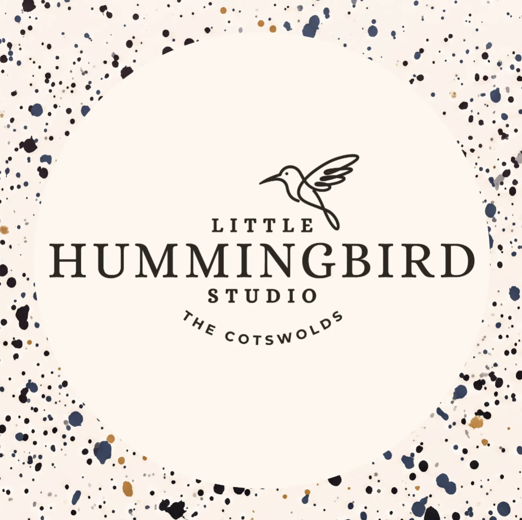
The other big milestone this month was finally taking the new market banner out for its first show. I wanted the stall to feel like Little Hummingbird Studio the moment anyone walked past, not just when they got close enough to spot the products and the banner was the missing piece.
I went with a paint splatter background behind the logo rather than anything too neat or corporate. It felt right for a handmade brand, a bit of movement and imperfection to go with all the clean line work on the tags and packaging. Sitting the circular hummingbird logo in the middle of that gives it a nice contrast: structured branding on a slightly random, expressive background.
Seeing it up at the stall for the first time was a proper "it's really happening" moment. After months of going back and forth on names, colours, and logo tweaks, having the banner finally standing behind the table pulled the whole look together.
Feedback Has Been Brilliant
Honestly, I couldn't have asked for a better response. Customers at the markets have been really taken with the new look. Several people commented on the tags specifically, which is lovely to hear given how much time went into getting them right. And it's not just in person either; the feedback online has been just as positive, with people picking up on the new branding across photos and posts.
It's reassuring after a fairly nerve-wracking few months of change. Renaming a business you've built up under a different name is daunting, but seeing it land well with customers, old and new, makes it feel like exactly the right call.
What's Next
With the tags sorted and the banner proven out at market, the rebrand is really starting to feel complete rather than "in progress." Next up is getting stock levels ready for the Christmas markets, and no doubt there'll be more little brand details to share as they come together.
Thanks for following along with the journey, more soon!